Brightening Up A Dark Kitchen
Our clients loved their Oregon City home, but the kitchen needed a remodel to incorporate some basic upgrades. The dark cabinetry cast a gloomy feel over the space, and the cramped layout made it difficult for both homeowners to cook together comfortably. While they wanted a more functional and inviting kitchen, they also wanted to maintain access to the adjacent dining room without a major overhaul. The challenge was to brighten the space, improve the flow, and add storage while preserving the core layout that worked for them.
To improve the kitchen’s flow, we made strategic adjustments without altering the overall layout. We relocated the fridge closer to the range, creating a more efficient work triangle that allowed for smoother movement between cooking zones. Removing part of a wall between the kitchen and dining room opened up the space even further, making it feel less cramped. The microwave was moved from its position over the oven to a spot next to the fridge, freeing up space and improving accessibility.
To brighten the kitchen and add visual interest, we replaced the dark wood cabinets with a two-tone design in blue and white. This not only lightened the space but also introduced a modern, vibrant aesthetic. Custom cabinetry solutions, including a fold-away mixer stand and Lazy Susan, maximized storage while maintaining a clean, organized look.
We added a bold patterned backsplash to bring character and contrast to the design. Textured subway tiles and quartz countertops enhanced the brightness, reflecting more light and making the kitchen feel larger. To further elevate the atmosphere, we installed large round pendant lights over the new island, providing both style and additional lighting.


Before and after
Hover over the photo to see the transformation!
Project Goals
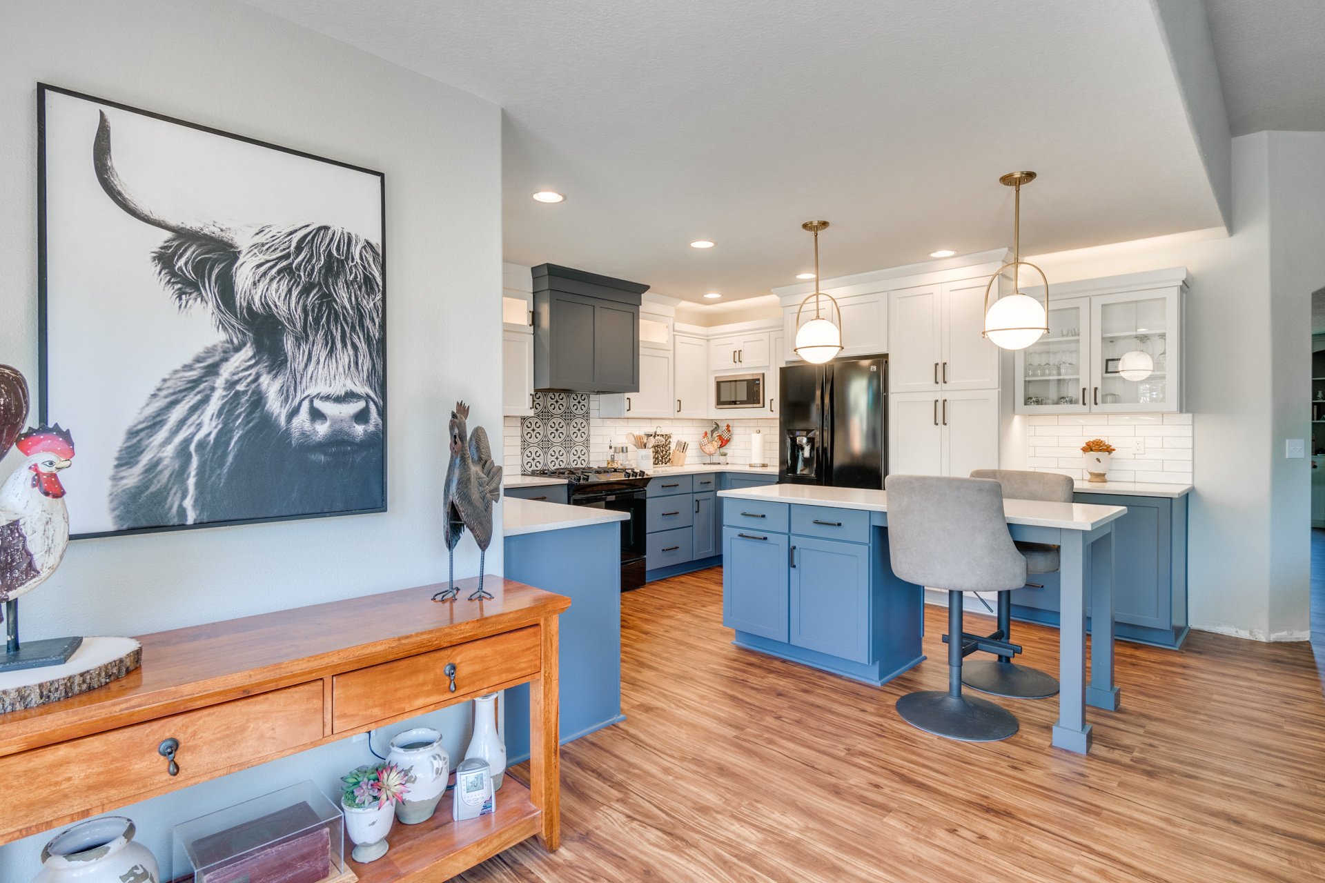
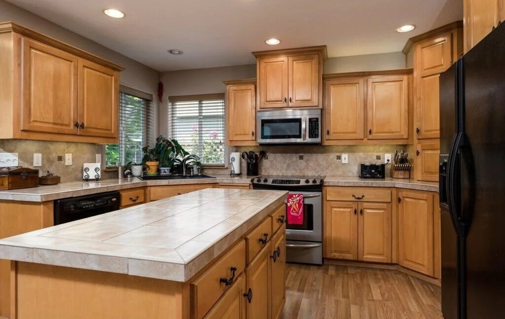
The homeowners had a clear vision for their Oregon City kitchen remodel. First, they wanted to improve the flow so that they could cook together without feeling boxed in. The dark cabinets and lack of natural light made the kitchen feel small and unwelcoming, so brightening the space was a priority. They also felt the need for additional storage, as the current layout didn’t provide enough space for kitchen essentials and appliances.
Another key factor was maintaining the overall floor plan, especially the access to the dining room. They loved the openness between the rooms and didn’t want to lose that connection. With these goals in mind, they sought to create a kitchen that felt more spacious, more efficient, and much brighter without completely changing the structure of the space.
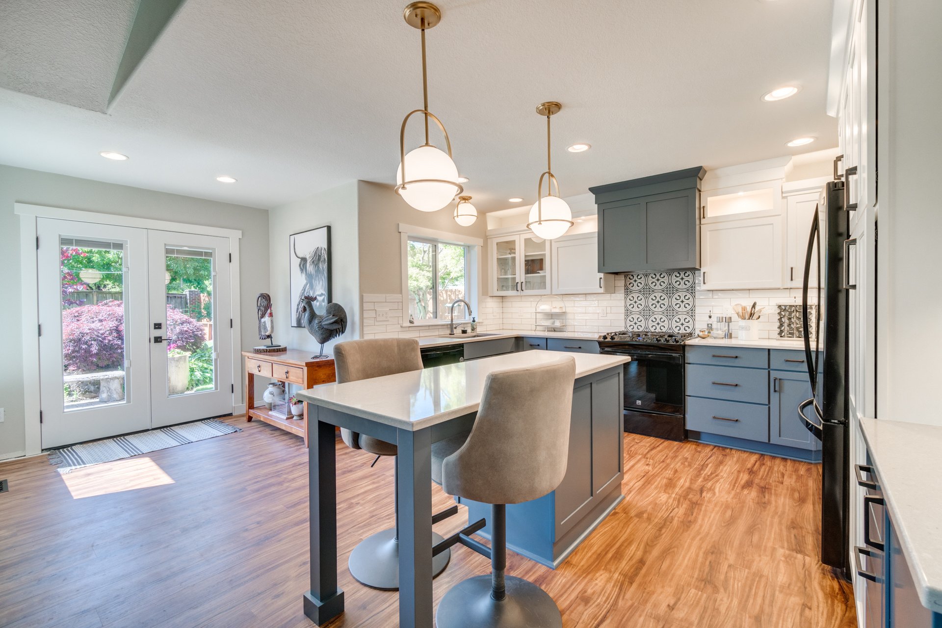
Unique Features
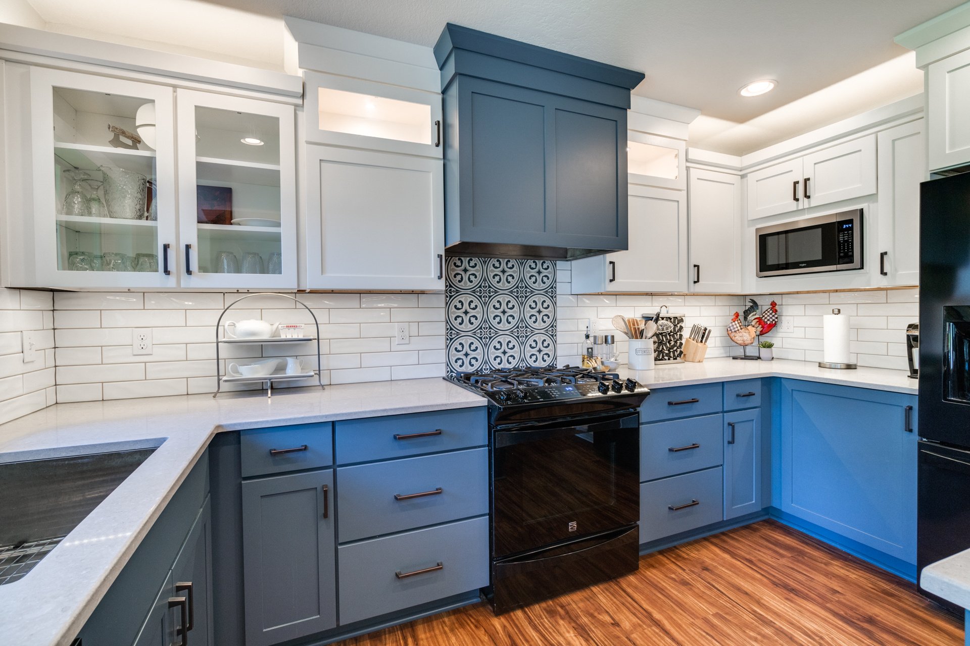
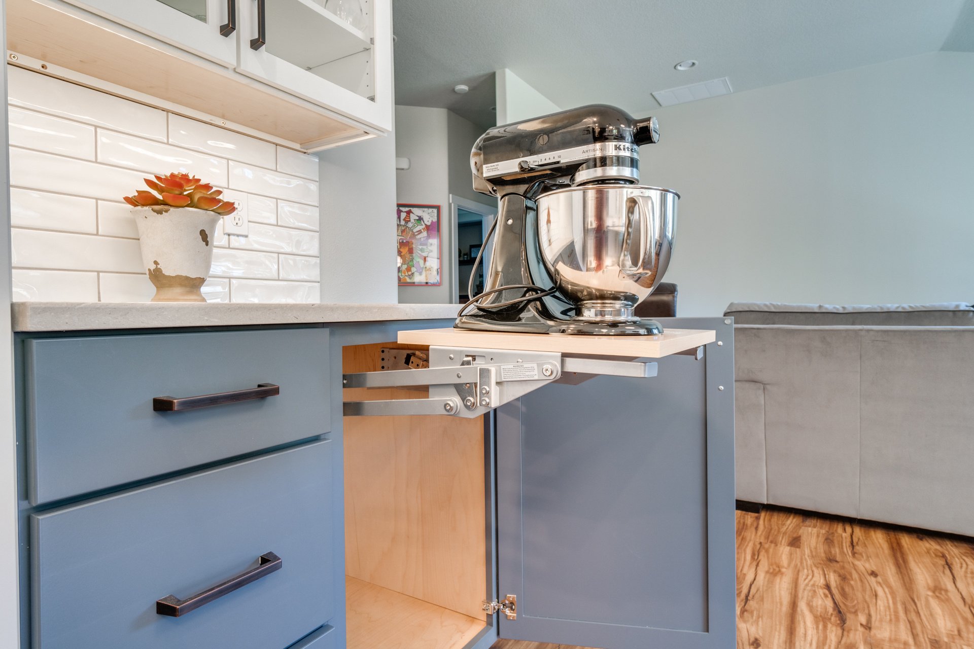
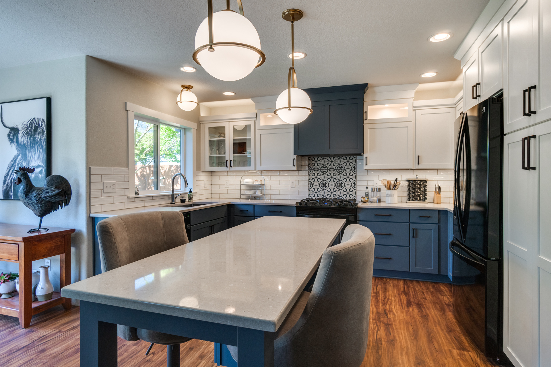
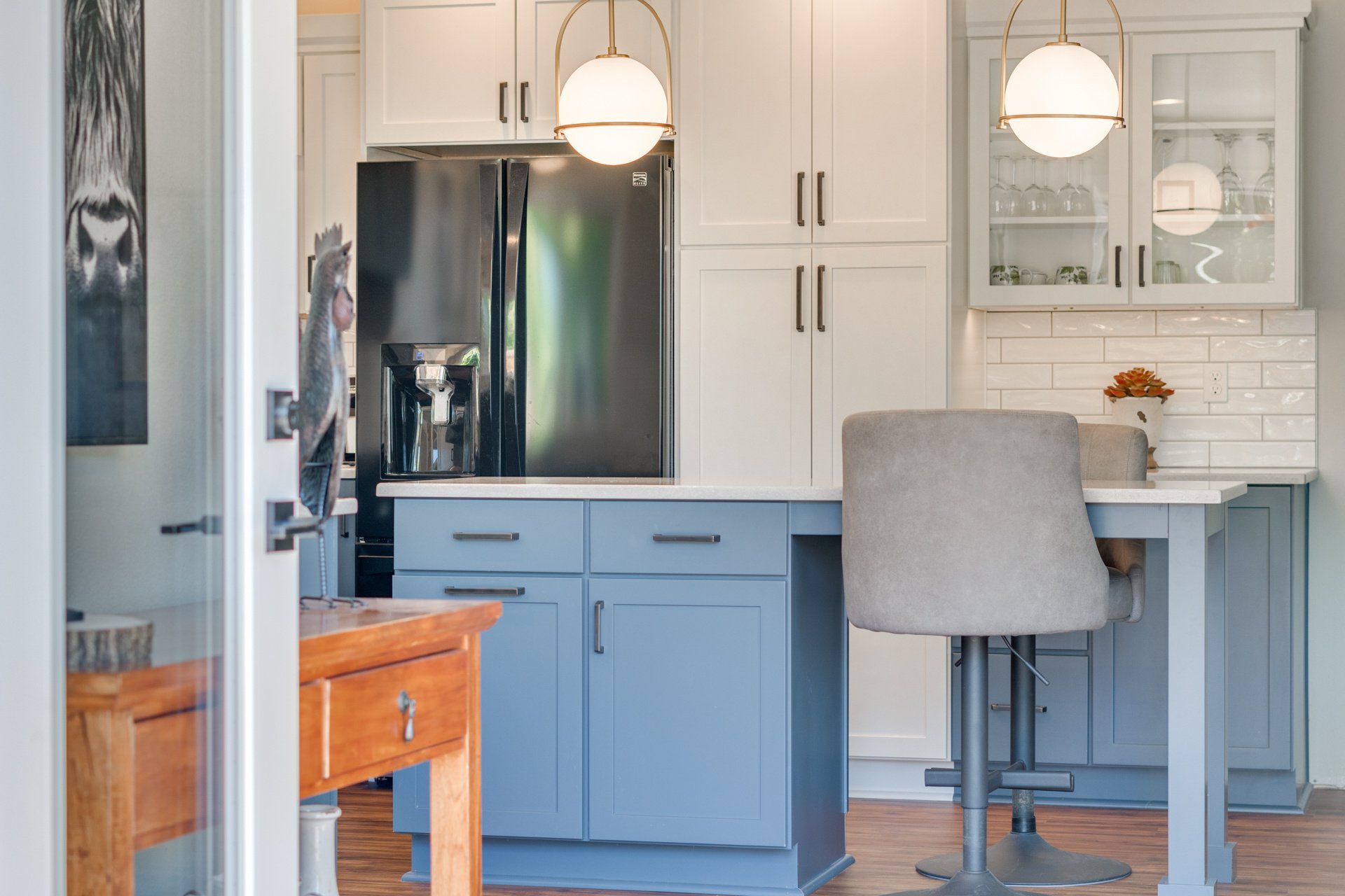
- Yorktowne “Classic” Series: Custom two-tone cabinetry in blue and white, with built-in storage features.
- Caesarstone Quartz Countertops in “Clamshell”: Durable, sleek quartz countertops that brighten the space. Quartz is a nonporous surface, which means low maintenance and high durability.
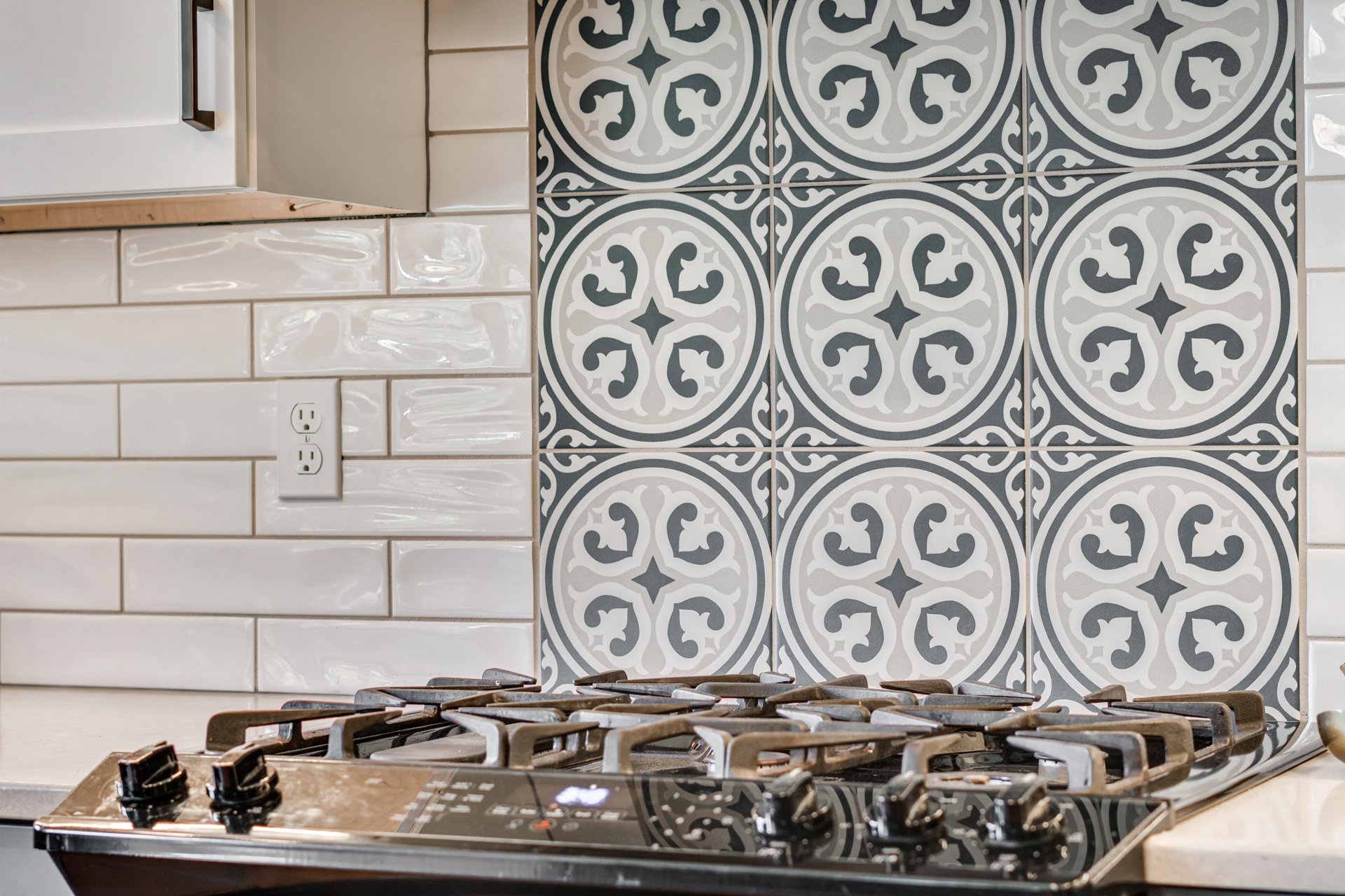
- Backsplash with Emser Glazed Porcelain Accent Tile: A bold, patterned backsplash that adds contrast and visual interest above the oven range.
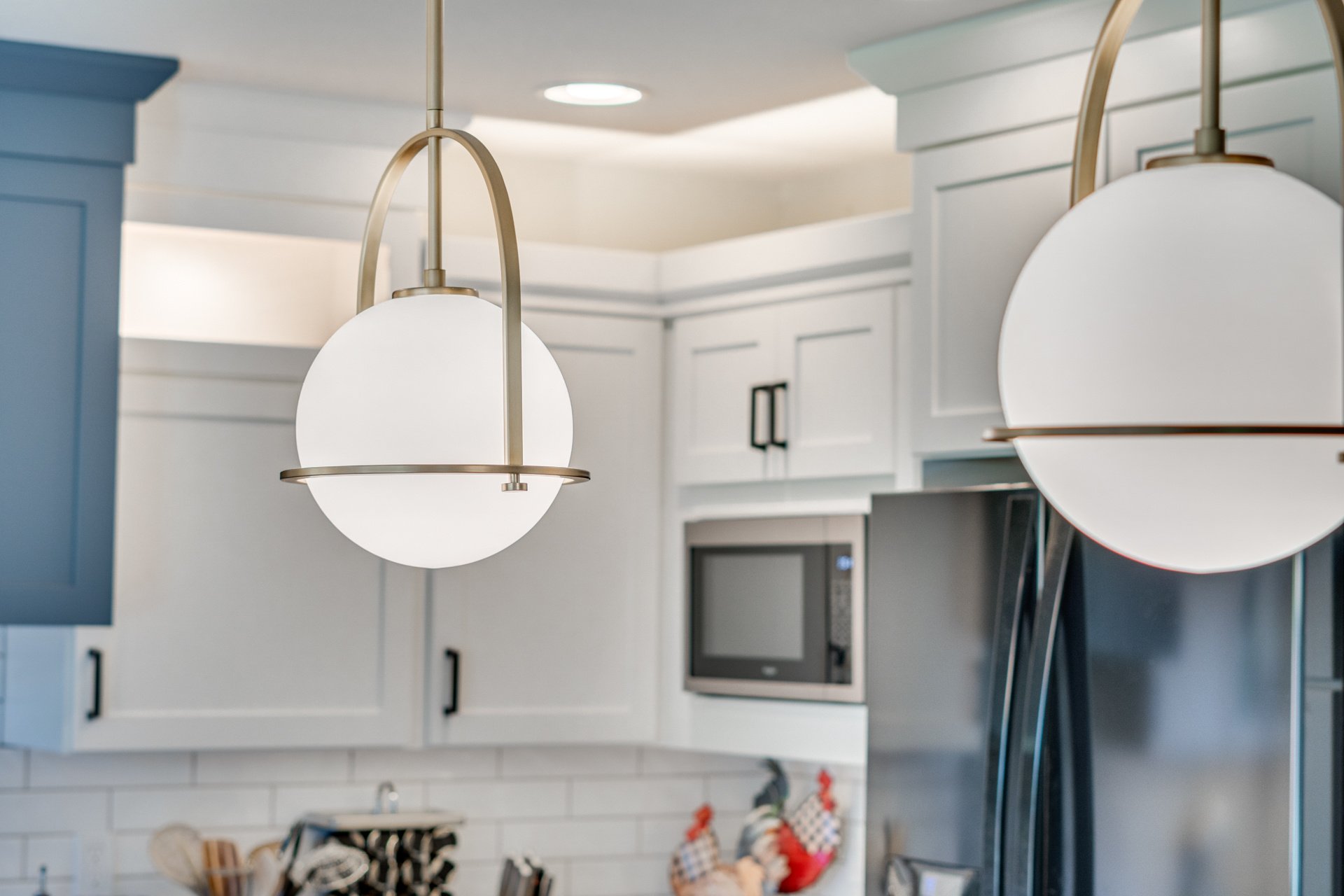
The kitchen has been transformed into a bright, functional space that the homeowners love. With improved flow and strategic storage solutions, they can now cook together comfortably without feeling cramped.

Meet the Design Team
Our dedicated team of professionals blends artistry and functionality, ensuring every detail reflects your unique vision.

Nikki
